Date
Nov 2019
rOLE
UX designer, Researcher
Context
My Role
I participated in the competitive research and user interview process and was responsible for the design, from wireframes to final UI, as well as the visual identity and style guide.
Problem Statement
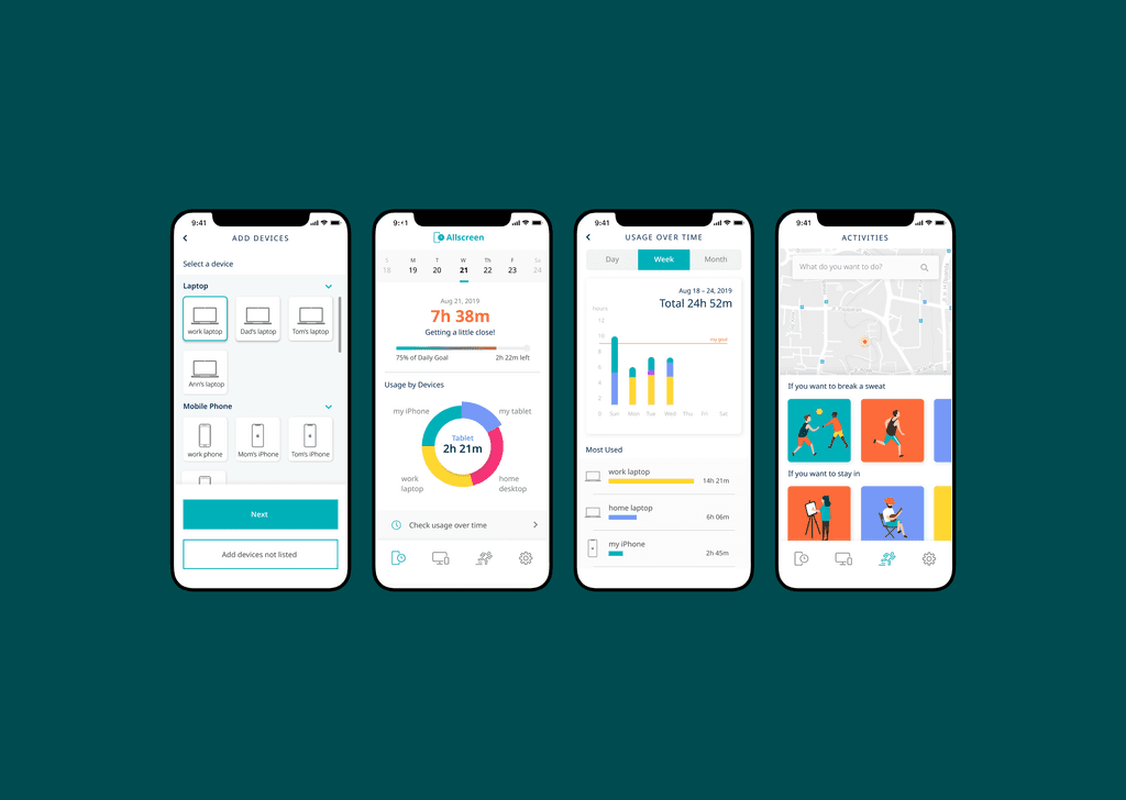
Final Design
The key features we built included:
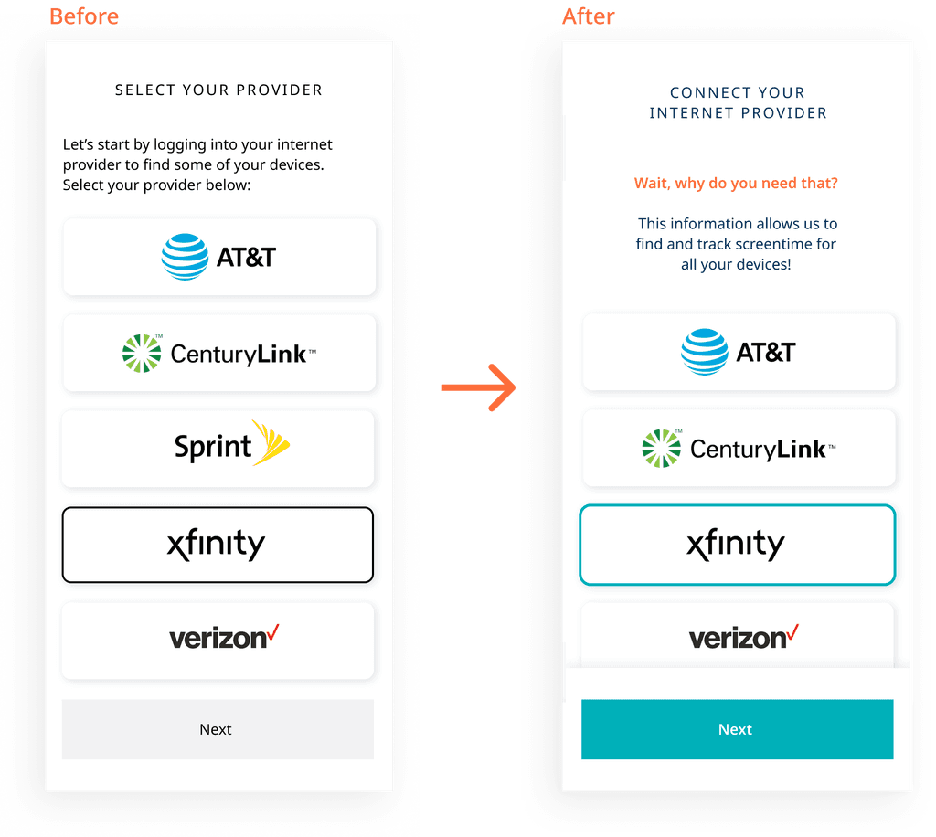
1. Onboarding

2. Multi-device setup


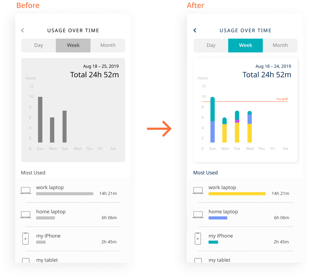
3. Dashboard & Screen time tracking

4. Find activities

So, how did we get there?
Part 1: Research
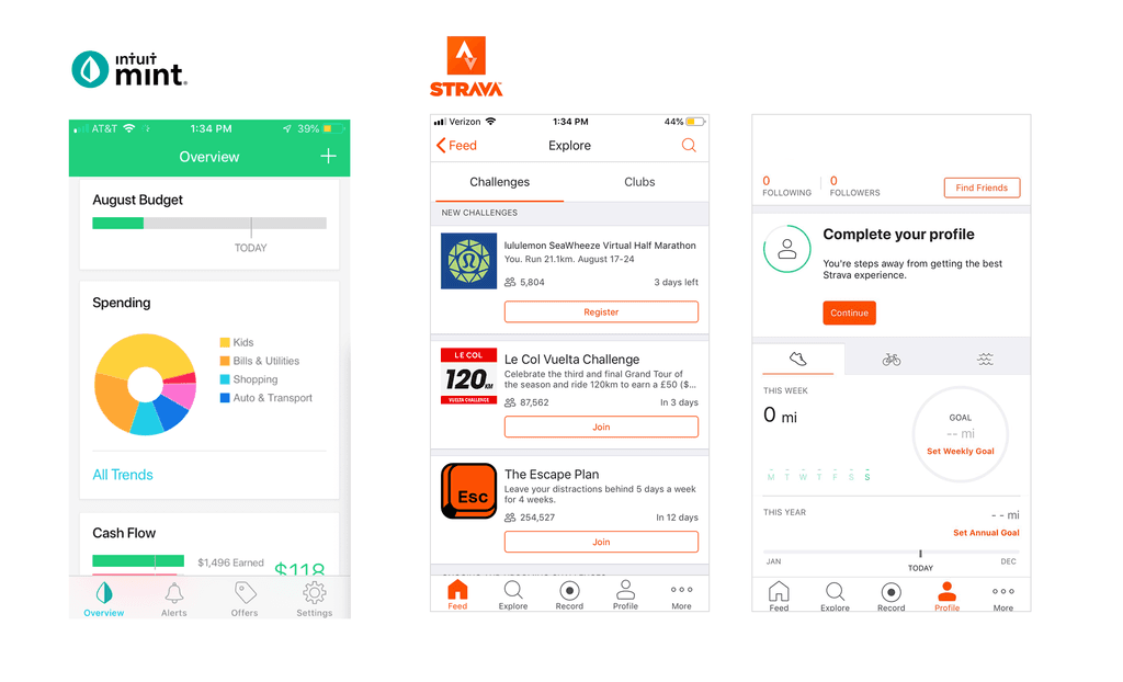
User Interviews
These insights helped us define the problem more clearly and informed the direction of our design.
Competitive Research
We analyzed a range of screen time and tracking apps to understand existing solutions and find opportunities for differentiation. Our research focused on key features, usability gaps, and cross-device capabilities.
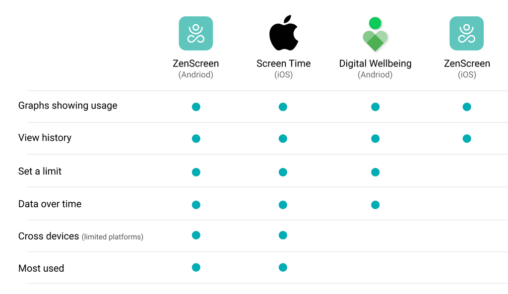
Here’s what we found:
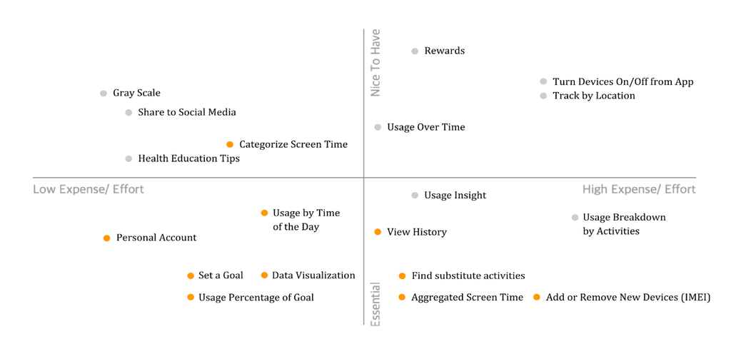
Feature Prioritization
We mapped out features by impact and effort, prioritizing the ones that would drive awareness and change without overwhelming users. Tracking progress against goals and offering easy ways to shift habits were key to our value proposition.
Part 2: Design
Concept Sketch

Wireframe

Iteration


Next steps
Staying up to date with IoT advances
Continue usability testing to validate changes
Ability to distinguish “productive” vs. “unproductive” screen time
Simplify Activities flow so activities can be found quickly (reduce screen time)