Date
Oct 2023 – Nov 2023
rOLE
Context
The problem
Timeline
Impact overview
Part 1: Discovery
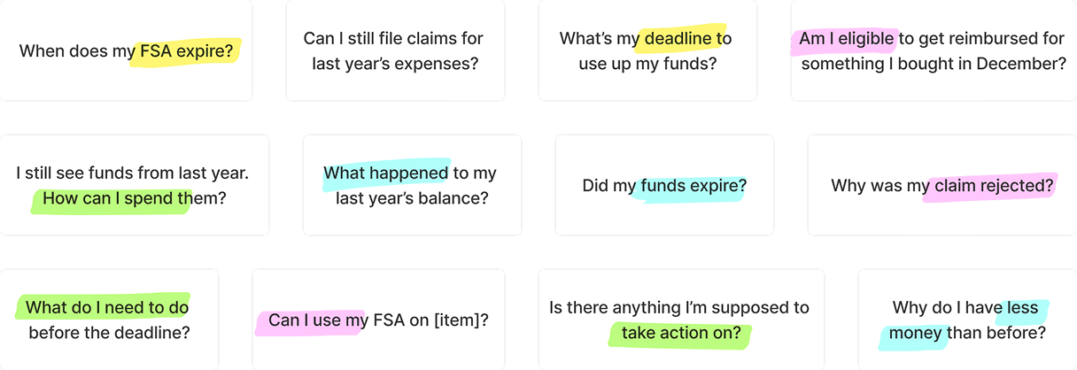
1. Deadline
2. Eligibility
3. Actions
4. Funds

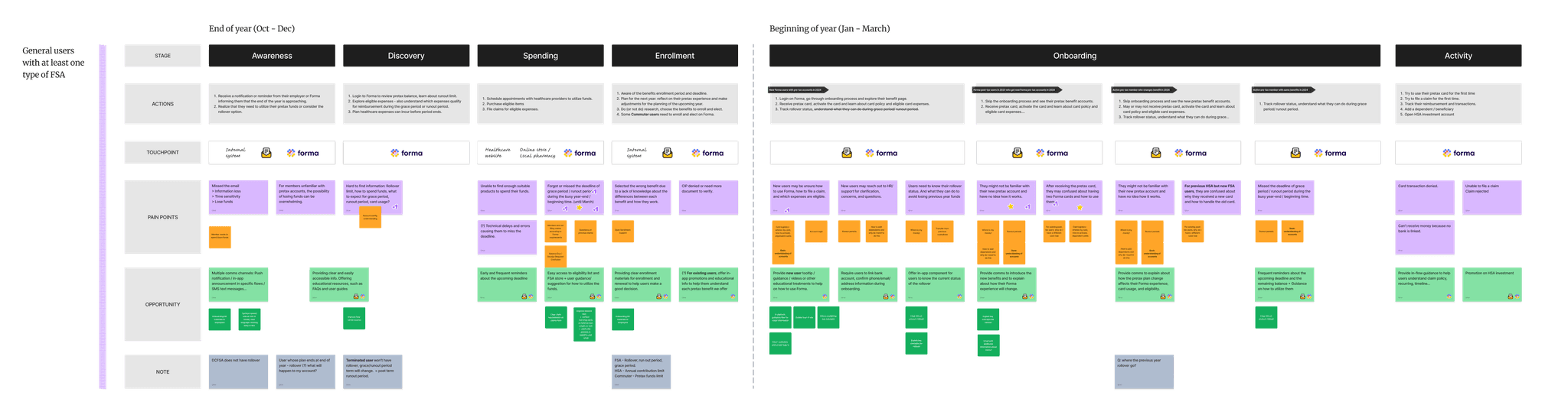
Mapping the year-end experience
Part 2: Design
What I designed, based on what I learned
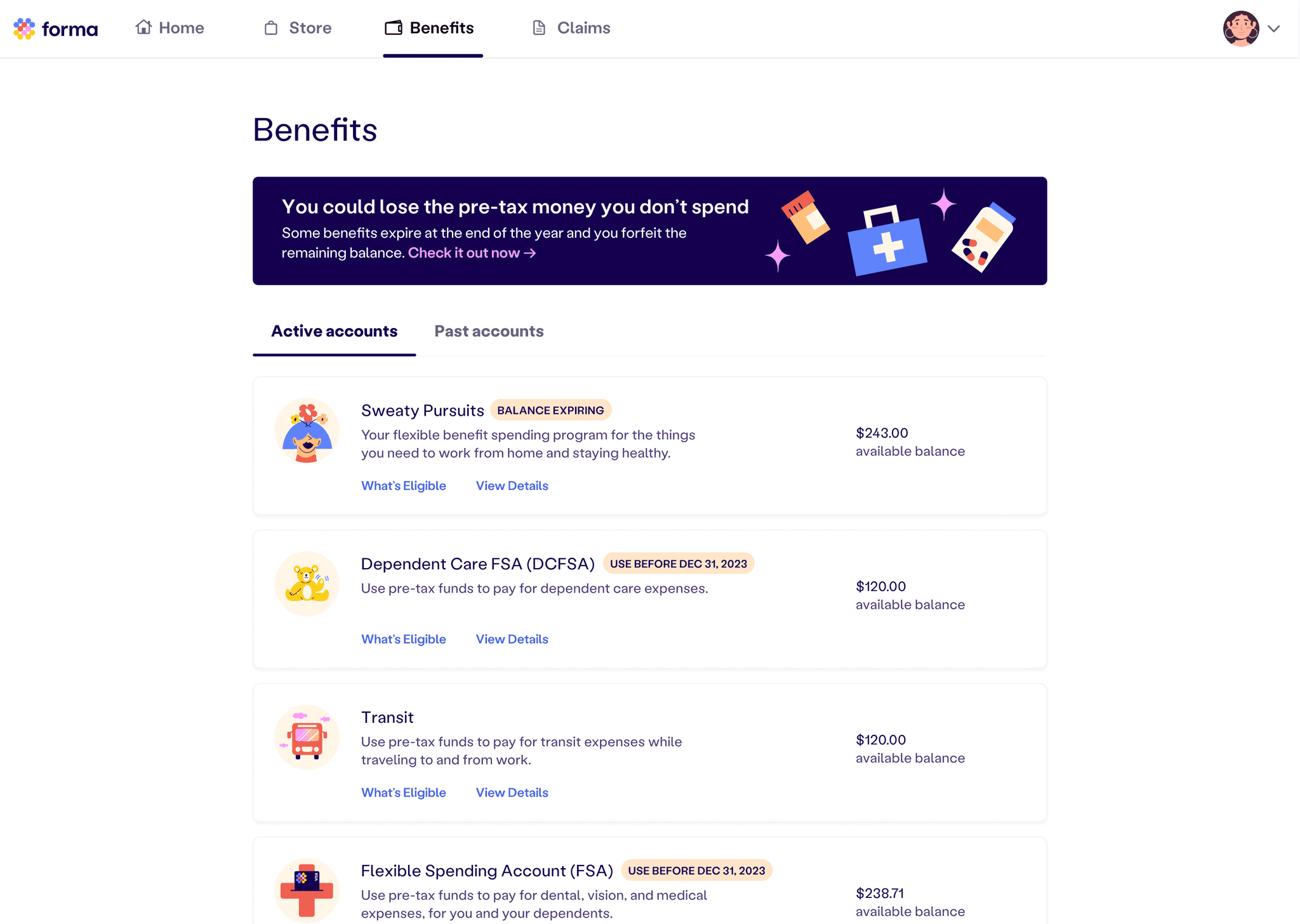
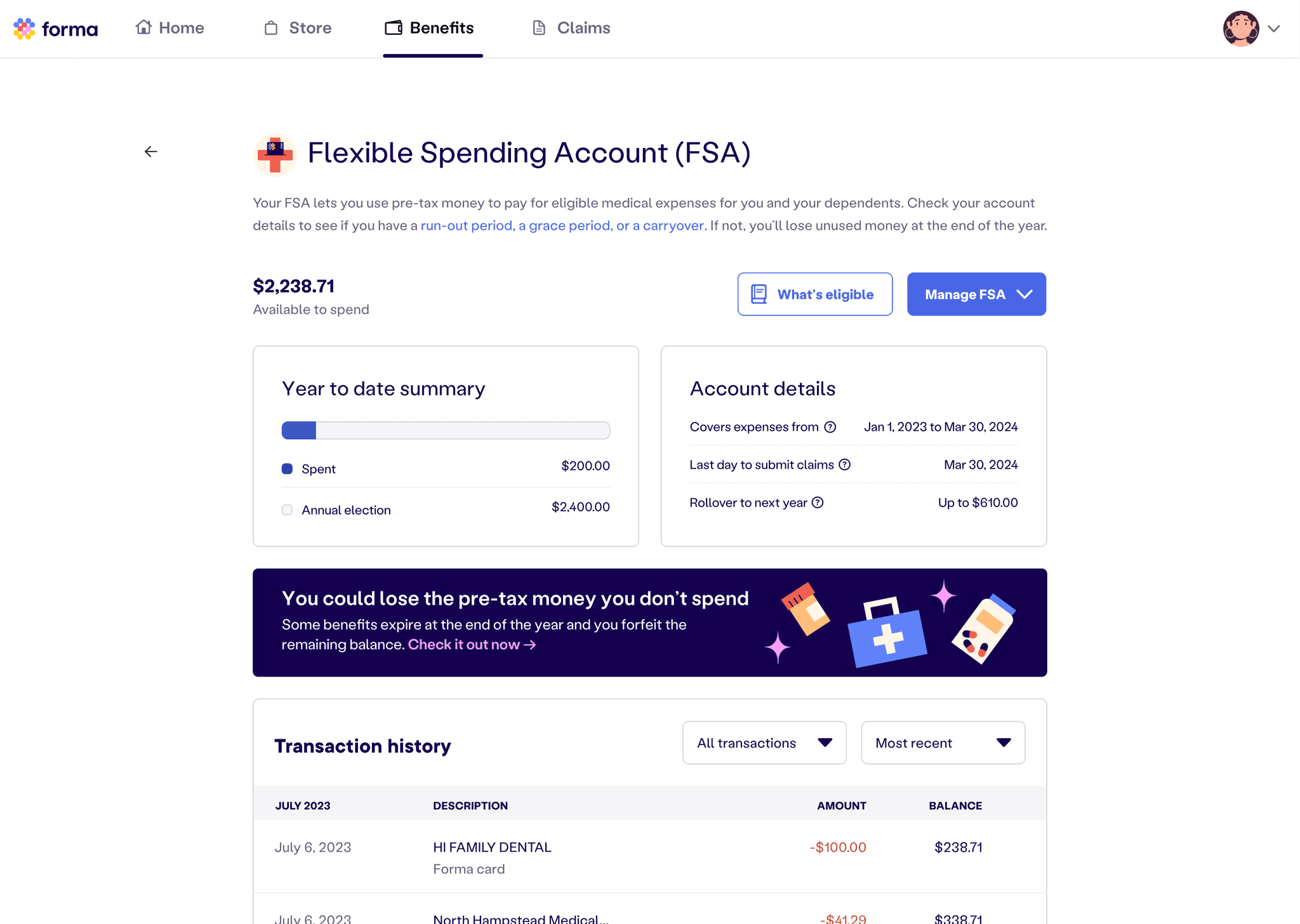
Even though key information was listed on the Benefit page, users often ignored it and looked for answers on the homepage or claim filing page instead.
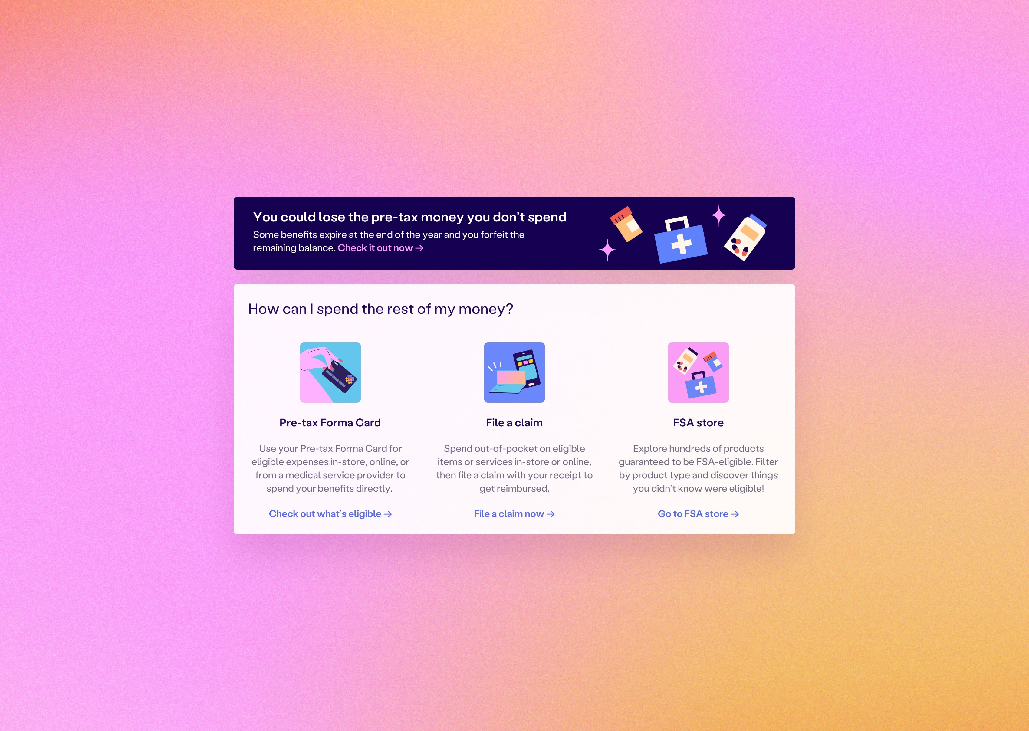
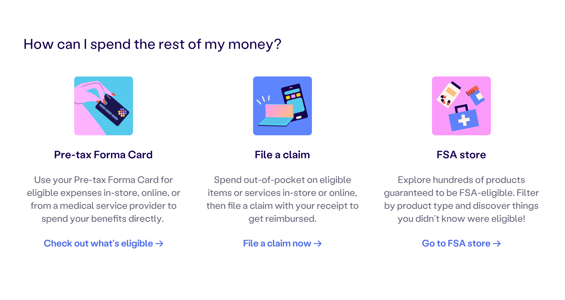
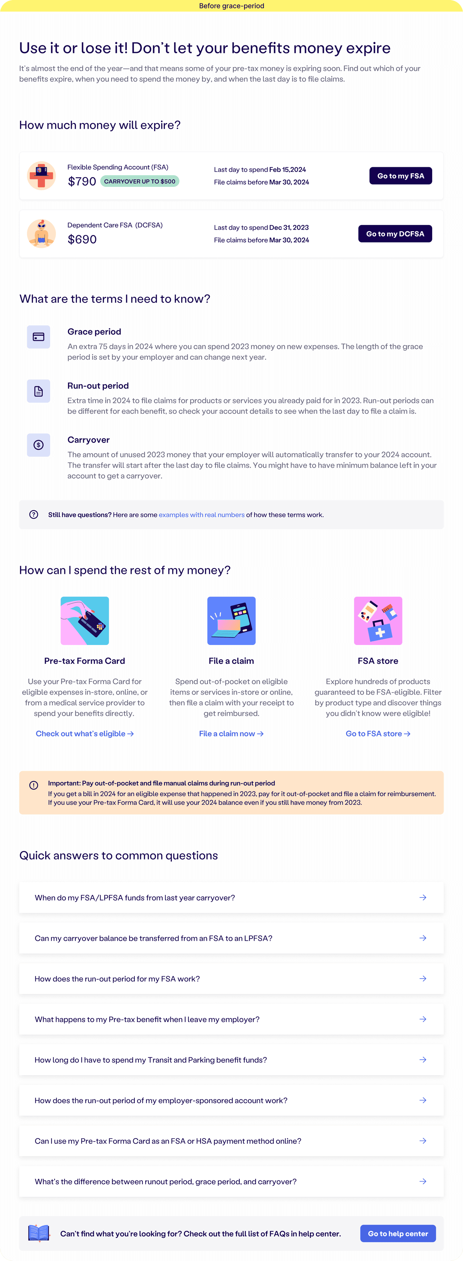
I placed banners and callouts on high-traffic surfaces like the homepage, claim page, benefit listings, and benefit homepage. Visual illustrations were added to draw attention.
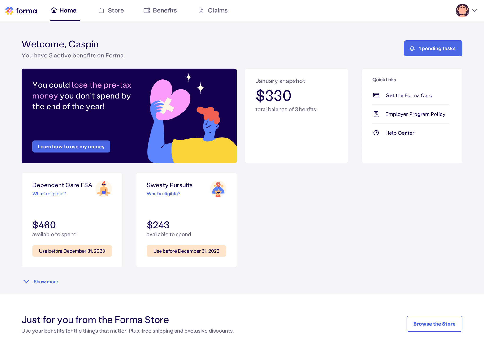
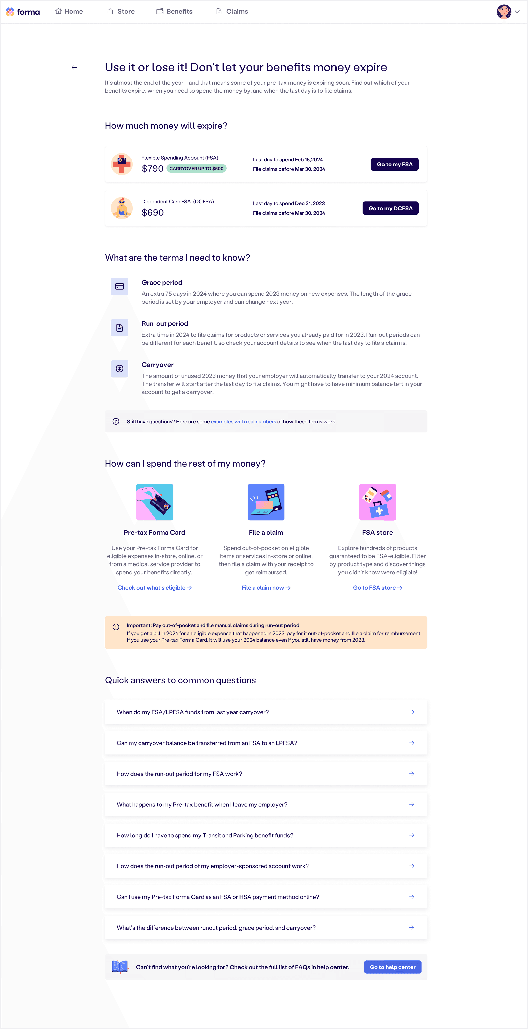
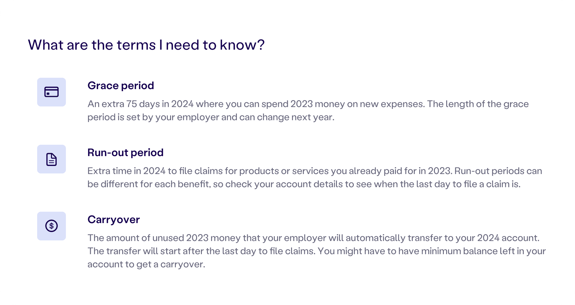
I created a one-pager that answered all key questions. Each banner led users to that page, making education more consistent and accessible.
Smartlook showed that users often ignored tooltips. Explanations were either too subtle or buried too deep in the flow.
Instead of using technical terms, I wrote banners using user-first language like “You could lose money if you don’t spend” and "Use it or lose it." Replaced technical terms with intuitive phrases like “How much money will expire?”

I used icons, clean layouts, and simple illustrations to highlight the most important content and make it clear what users need to understand and act on.
User confusion peaked around year-end, showing that education needs to follow seasonal timing.
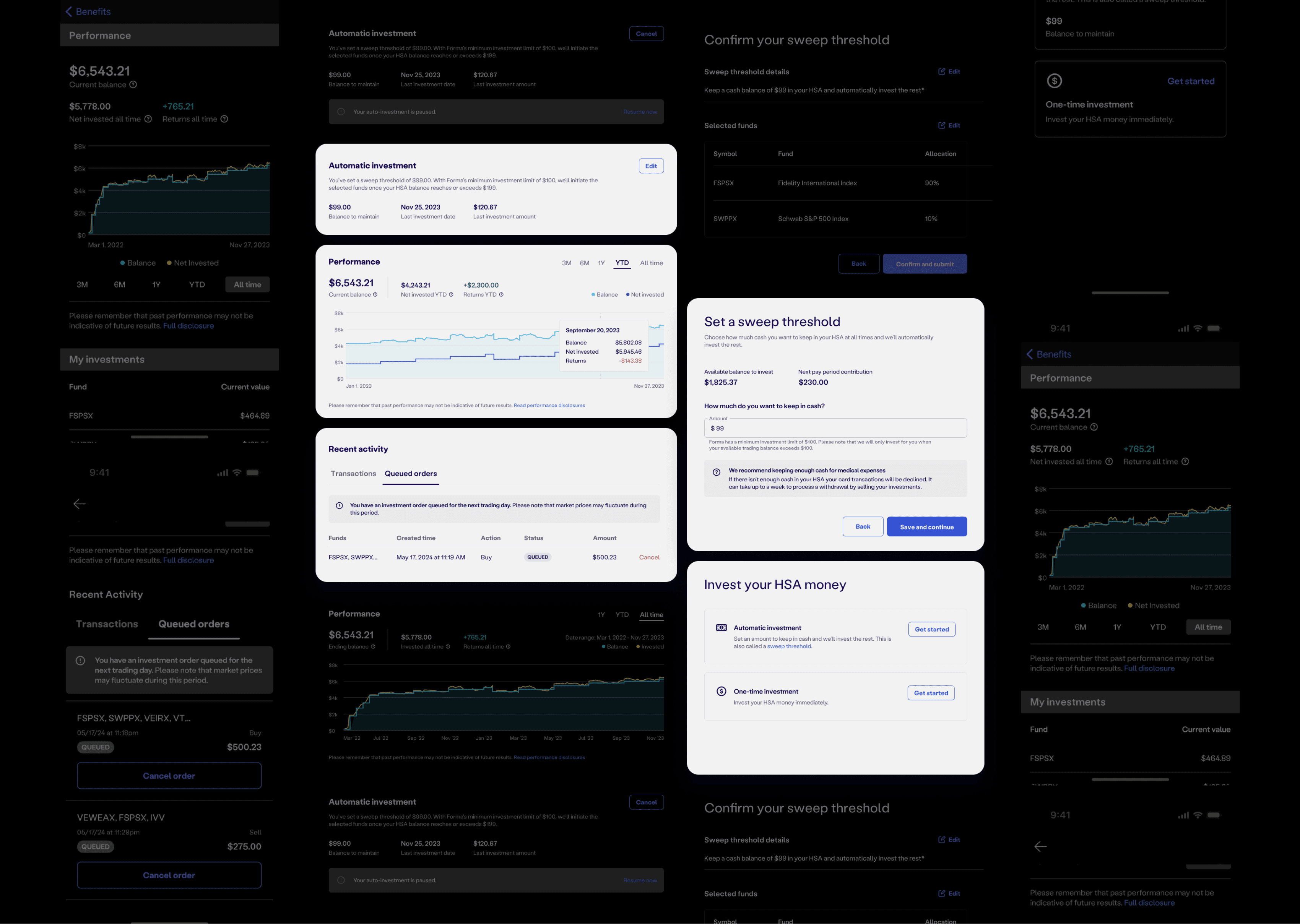
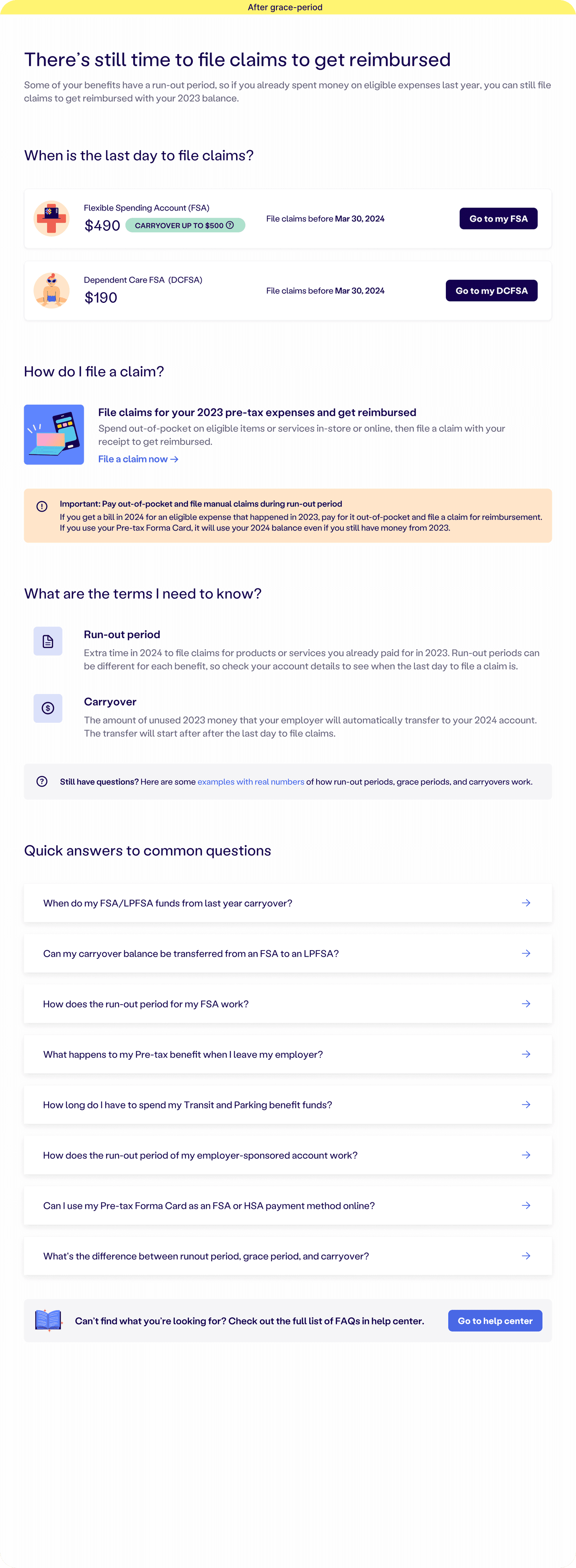
I made the experience time-sensitive. I created a separate banner for the runout period. We started displaying banners 60 days before each key deadline. Once the grace period deadline passed, the runout banner would appear. We also added tasks to each user’s task center, along with a notification reminder to prompt timely action.

We also updated the one-pager after the grace period ended, removing outdated information and keeping only what was still useful. This helped reduce confusion during the runout period and made the guidance feel more relevant.
Turning complex rules into reusable systems
The Challenge
What I did
I spent two days auditing our customer settings data to map out all the possible combinations. From there, I listed exactly what should be shown in each scenario, which served as a reference spec for engineering and ensured a smooth implementation.

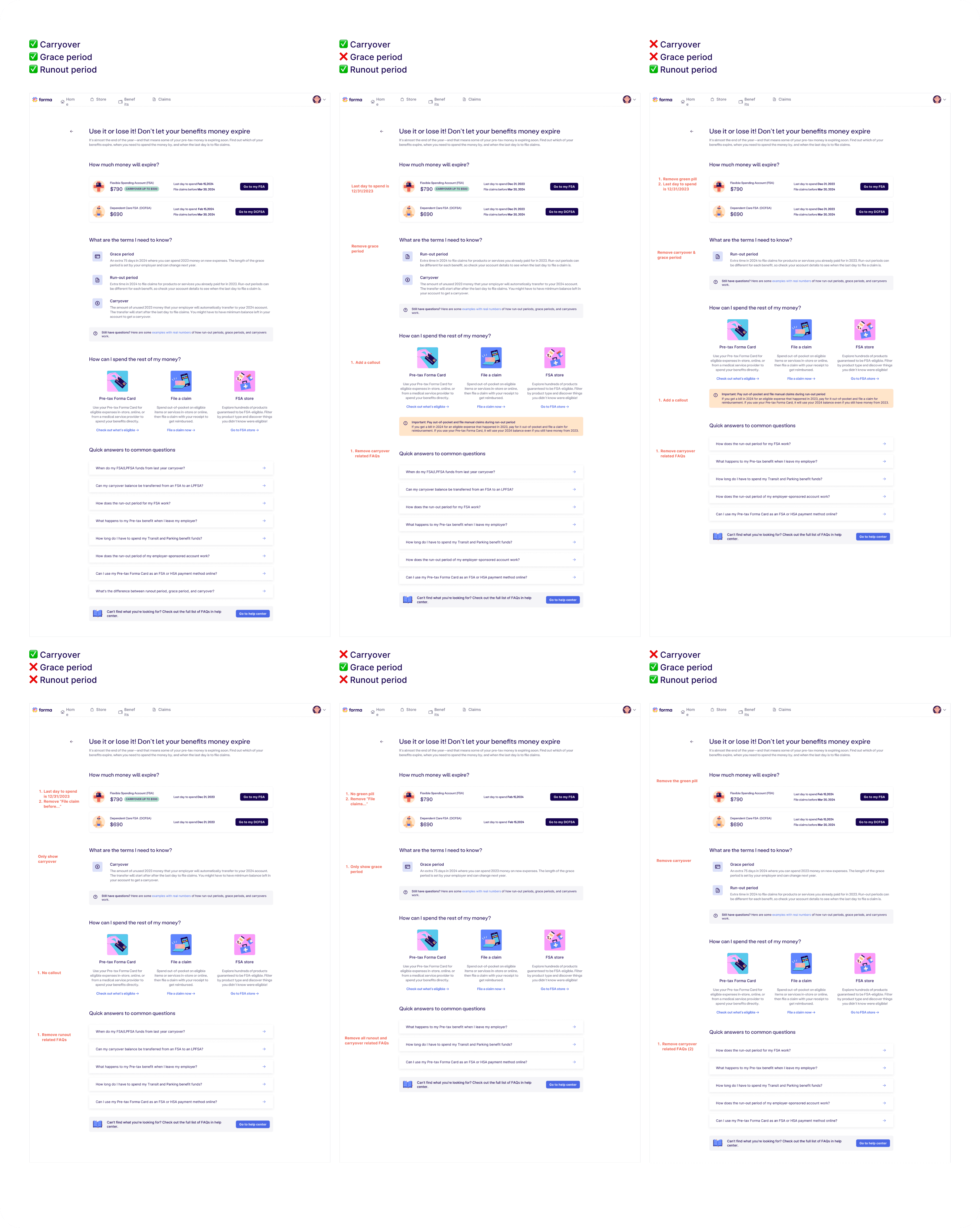
The impact
This logic now powers an automated system that adapts to each employer’s unique rules — from grace periods to carryover limits. With over 90 companies and 65,000 employee accounts on Forma’s platform, this foundation enables us to deliver timely, personalized guidance at scale, year after year.
Next steps
1. Add email reminders
2. Simplify action through automation
We’re exploring visual and behavioral patterns like checklists, smart suggestions, and calendar-style reminders. These formats help simplify complex rules, making it easier for users to know what to do without needing to dig through documentation.
3. Simplify action through automation
We’re also looking beyond education to reduce friction in action. One opportunity is to make reimbursement easier and faster by exploring features like automatic receipt scanning and real-time adjudication. The goal is to help users file claims with fewer steps and more confidence.