Automatic Investment: Turning Manual Tasks into Seamless Flows

Automatic Investment: Turning Manual Tasks into Seamless Flows

Automatic Investment: Turning Manual Tasks into Seamless Flows

Date

Mar 2024 – Jun 2024

Mar 2024 – Jun 2024

Mar 2024 – Jun 2024

rOLE

Product designer, Researcher

Product designer, Researcher

Product designer, Researcher

I led the end-to-end design of Forma’s automatic investing feature, helping users invest consistently without extra effort. I worked closely with engineering to assess technical risks and edge cases, like pausing during withdrawals. The result was a simple, flexible setup that gave users control while automating the hard parts. It worked well across different user types and delivered real impact with minimal friction.

I led the end-to-end design of Forma’s automatic investing feature, helping users invest consistently without extra effort. I worked closely with engineering to assess technical risks and edge cases, like pausing during withdrawals. The result was a simple, flexible setup that gave users control while automating the hard parts. It worked well across different user types and delivered real impact with minimal friction.

I led the end-to-end design of Forma’s automatic investing feature, helping users invest consistently without extra effort. I worked closely with engineering to assess technical risks and edge cases, like pausing during withdrawals. The result was a simple, flexible setup that gave users control while automating the hard parts. It worked well across different user types and delivered real impact with minimal friction.

Context

Context

After Forma launched its HSA product MVP in 2022, we discovered several experience gaps impacting both user engagement and enterprise satisfaction. Users lacked investment visibility, automation, and flexible trading hours which led to frustration and missed opportunities. By the end of 2023, we aligned with leadership to prioritize three major upgrades for the first half of 2024.

Three key features we shipped

In early 2024, we turned those priorities into three new features, all built from scratch. Together, they made HSA investing easier to track, easier to automate, and easier to manage around a full-time schedule.

🏁 Keep scrolling to dive deeper into one of them: Automatic Investment

🏁 Keep scrolling to dive deeper into one of them: Automatic Investment

This case study focuses on Automatic Investment, which allows users to grow their HSA without manual effort. Want to see more? Check out the other two features we built: Performance graph and After-hour orders.

My Role

As the sole designer, I partnered with the PM and engineering team to explore automation models and assess feasibility. I led the end-to-end design of the auto-invest flow, including setup configuration, investment dashboard for visibility and control, and exception handling such as allowing users to pause automation during withdrawals.

As the sole designer, I partnered with the PM and engineering team to explore automation models and assess feasibility. I led the end-to-end design of the auto-invest flow, including setup configuration, investment dashboard for visibility and control, and exception handling such as allowing users to pause automation during withdrawals.

As the sole designer, I partnered with the PM and engineering team to explore automation models and assess feasibility. I led the end-to-end design of the auto-invest flow, including setup configuration, investment dashboard for visibility and control, and exception handling such as allowing users to pause automation during withdrawals.

Scope & Timeline

Discovery began in Q4 2023 with PM partnership. After research and feasibility exploration, implementation started in March 2024. We launched the experience by June with one PM and three engineers.

Impact overview

By the end of 2024, our efforts led to measurable product and business outcomes.

By the end of 2024, our efforts led to measurable product and business outcomes.

By the end of 2024, our efforts led to measurable product and business outcomes.

75%

drop in user-reported investment difficulty via NPS survey

drop in user-reported investment difficulty

drop in user-reported investment difficulty

2x

increase in total HSA active users from 11k to 23k

increase in total HSA active users from 11k to 23k

increase in total HSA active users from 11k to 23k

0

2x

customer churn due to HSA investment issues post-launch

growth in HSA investment AUM from $21M to $40M

customer churn due to HSA investment issues post-launch

2x

0

growth in HSA investment AUM from $21M to $40M

customer churn due to HSA investment issues post-launch

growth in HSA investment AUM from $21M to $40M

These outcomes were the result of three focused product efforts, each addressing a key gap in the investment journey.

These outcomes were the result of three focused product efforts, each addressing a key gap in the investment journey.

These outcomes were the result of three focused product efforts, each addressing a key gap in the investment journey.

Part 1: Discovery

Understanding the pain of manual investment

To understand where the friction came from, I first looked at how HSA investing worked.

To understand where the friction came from, I first looked at how HSA investing worked.

To understand where the friction came from, I first looked at how HSA investing worked.

How HSA investing worked

HSA accounts were funded automatically through payroll, with money added every pay cycle. But unlike other benefits, investing wasn’t automatic. Users had to log in manually each time, check their balance, and place trades themselves. Since money kept coming in regularly, this wasn’t a one-time task—it had to be repeated over and over.

The pain of manual investing

This made the process especially painful for passive users. Many forgot to invest or delayed action, which left their funds sitting idle in cash. Internal research showed that 38% of HSA holders viewed their accounts as long-term investment tools, yet had no easy way to grow them automatically.

What the old investment flow revealed

What the old investment flow revealed

Before exploring solutions, I mapped out the current investment experience to pinpoint where friction occurred. I reviewed our existing benefit pages and used Smartlook to observe how users were navigating the flow in real time. My goal was to understand their actual behavior, not just the idealized path.

Currently users had to repeat the same 4-step process every pay cycle without any automation or reminders:

✅ Key pain points

• Users received no reminders and had to log in and invest manually every few weeks

• The process was repetitive, easy to forget, and discouraged long-term engagement

• Enterprise clients viewed the lack of automation as outdated and inefficient

• Users received no reminders and had to log in and invest manually every few weeks

• The process was repetitive, easy to forget, and discouraged long-term engagement

• Enterprise clients viewed the lack of automation as outdated and inefficient

• Users received no reminders and had to log in and invest manually every few weeks

• The process was repetitive, easy to forget, and discouraged long-term engagement

• Enterprise clients viewed the lack of automation as outdated and inefficient

Competitive audit: learning from Betterment and Lively

I wanted to learn how others solved for automation: How much flexibility did they offer? How did they guide users through setup without overwhelming them? To inform our approach, I conducted a competitive audit of leading platforms including Betterment and Lively.

What I learned from Betterment ✨

Betterment offered highly flexible scheduling and strong in-product guidance. Users could match contribution to their pay cycle, choose a start date, and pick between fixed dollar or percentage contributions. They also used projections and tooltips to help users feel more confident when selecting amounts.

🔹 Overall takeaway: Betterment prioritized control and flexibility, but may with a bit more complexity in setup.

What I learned from Lively ✨

Lively took a much simpler approach. Their auto-deposit flow lived in a single modal, with one-step setup that felt fast and frictionless. Options like one-time deposits or sweep thresholds were laid out clearly on a landing page. Real-time deposit status also gave users confidence and clarity.

🔹 Overall takeaway: Lively prioritized speed and simplicity, but the modal-based setup lacked clear guidance or context. Without in-product support, users might feel less confident about how their deposits are handled.

Part 2: Design

Turning insights into concepts

After gathering these insights, I started the first design round by rethinking how users start investing, what options they see, and how we explain them.

A new start point

To reduce confusion and guide users up front, I introduced a new “Invest Money” landing page that clearly separates all available investment methods: manual and automated. This helped users compare options at a glance and pick what fits them best.

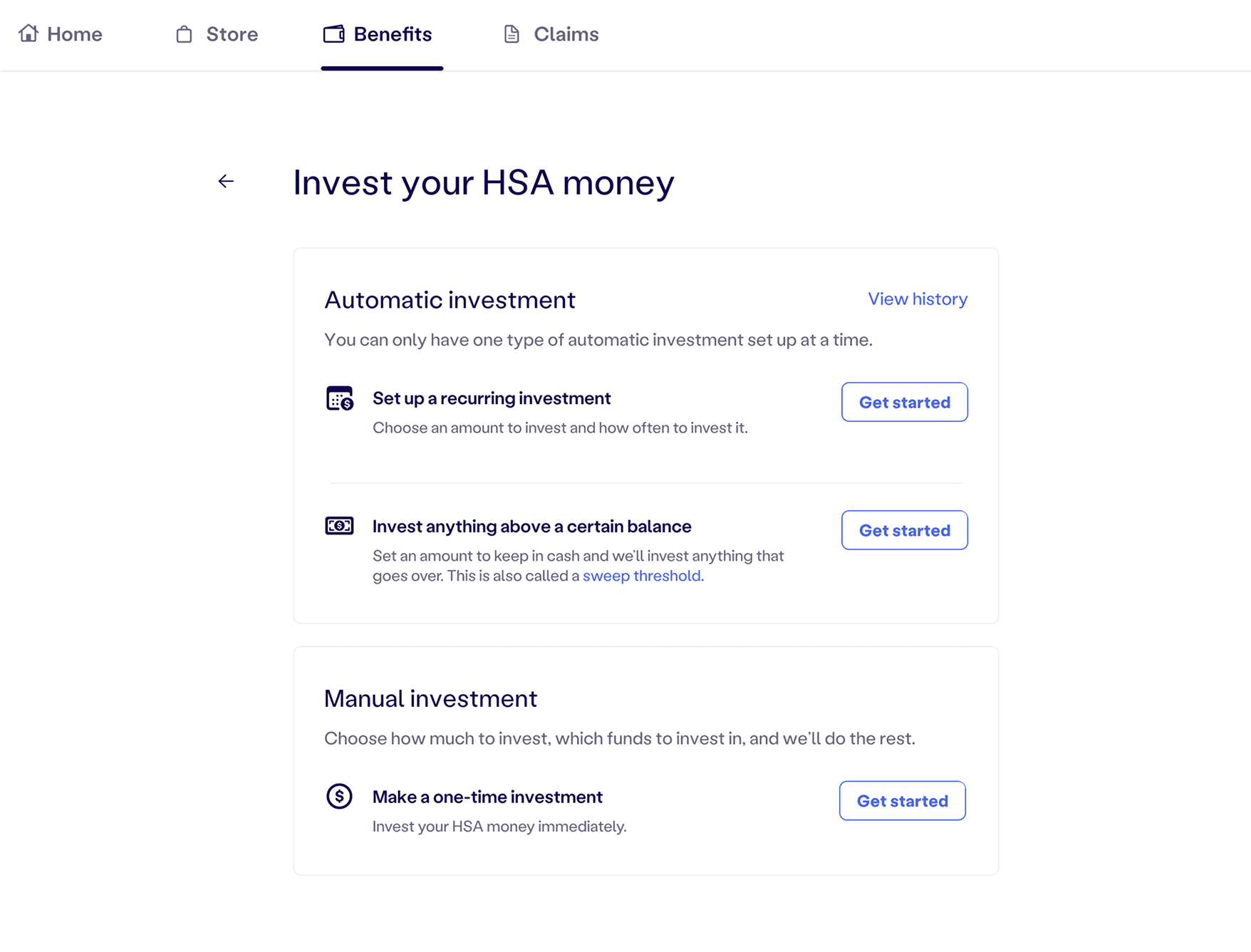
Two automation models to explore

Building on that foundation, I designed two new automation options:

  • ⏰ Recurring investment – invest a fixed amount on a schedule

  • 📈 Invest above a balance – automatically invest any funds above a threshold

Simplifying the language

To make the flows more approachable, I worked with our copywriter to replace jargon with plain, action-oriented text.

For example: “Invest anything above a certain balance” instead of “Set your sweep threshold”

Exploring Recurring Investment

I started by designing a recurring investment option. The idea was simple: let users decide how often to invest, like monthly or biweekly, and choose a preferred start date.

How much flexibility is too much?

At first, this felt like the right direction. Giving users control over frequency and timing seemed empowering.

But as I fleshed out the details, questions started to surface. How much choice is actually helpful? Would too many options overwhelm people or lead to setup errors?

Even though engineering hadn’t been looped in yet, I decided to proactively connect with them to understand the technical implications. I wanted to validate if our design assumptions were feasible and identify any risks early on.

Contribution timing is not guaranteed

Things got more complicated once we looped in engineering. Since HSA funding is tied to payroll, there was no guarantee the money would arrive before the scheduled investment. That meant recurring investments could fail silently or get delayed, which raised difficult questions about retries, notifications, and user trust.

Given these uncertainties and a tight timeline, we decided not to include recurring investment in the initial release.

Cash Sweep: A simpler and more reliable solution

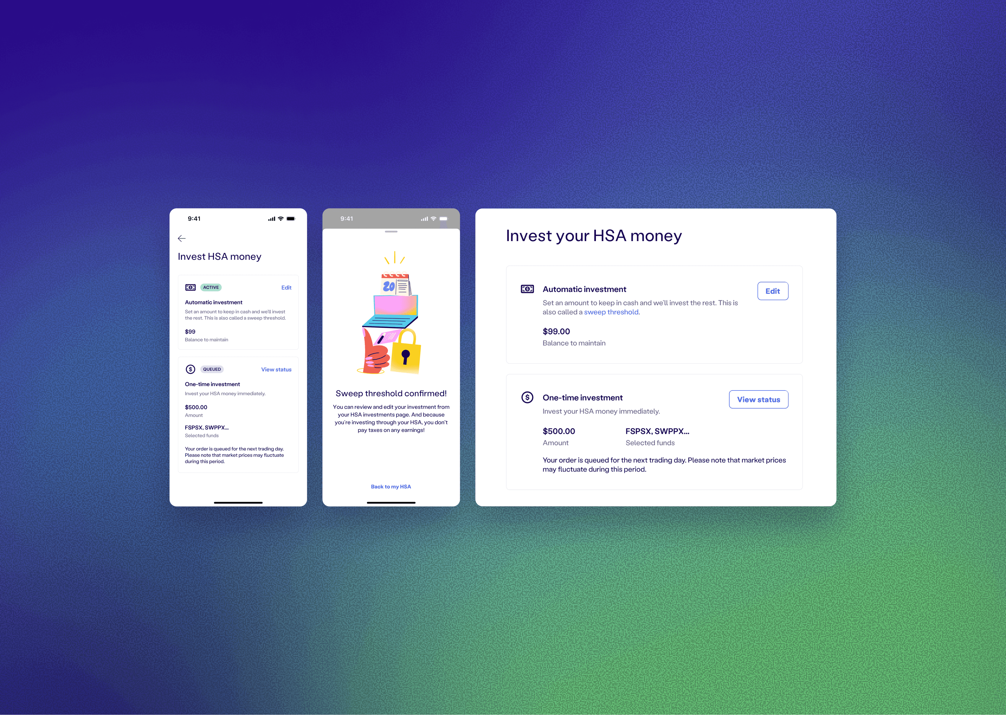
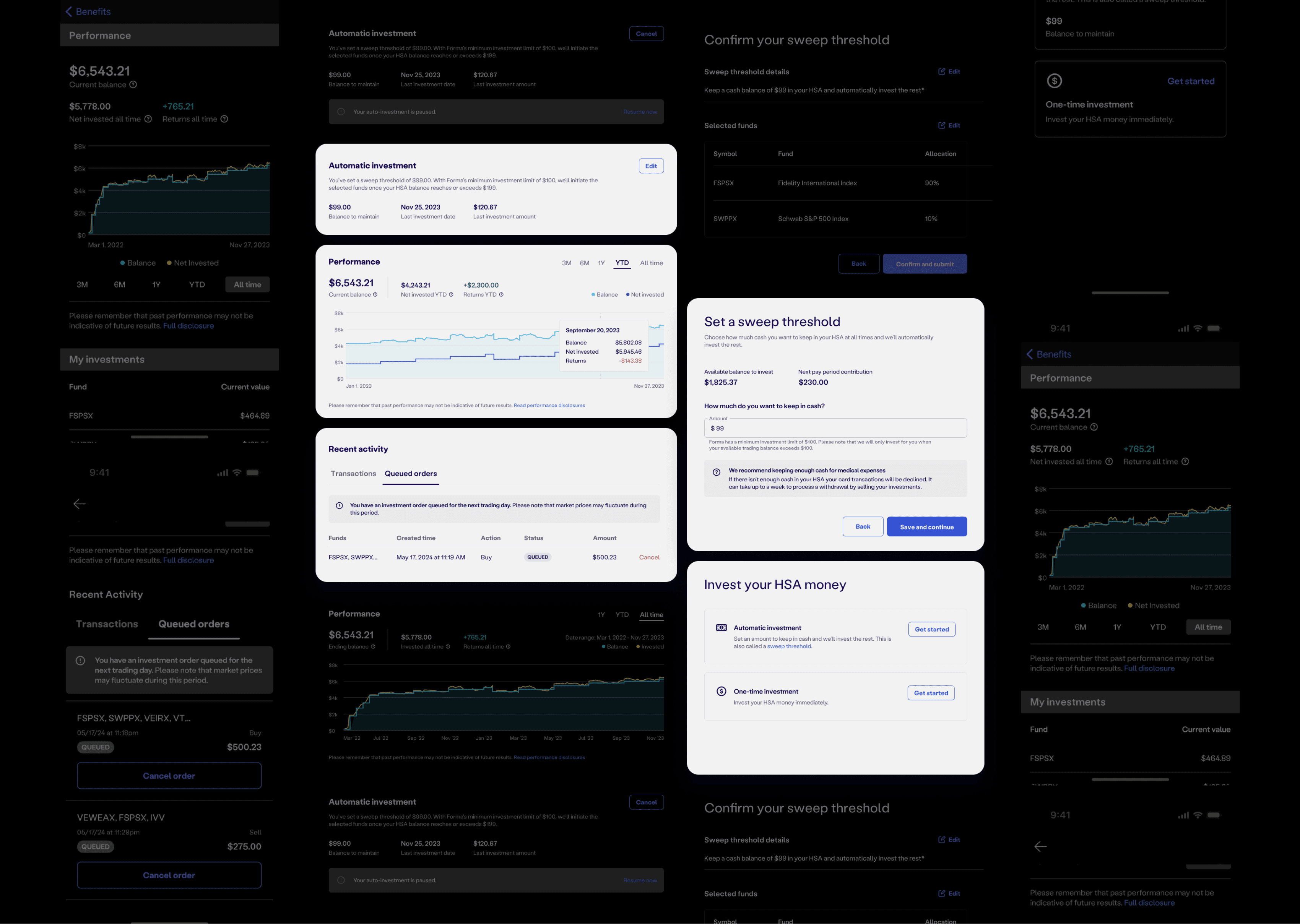
Instead, we moved forward with Cash Sweep. This method allowed users to set a threshold for how much cash they wanted to keep in their HSA. Any amount above that threshold would be automatically invested.

Unlike recurring investment, Cash Sweep did not depend on timing or external systems. It was technically simpler and far more predictable to implement. From a user perspective, the interaction was also straightforward.

This approach allowed us to launch a reliable auto-investing experience within a tight timeline, while still delivering meaningful value to users.

A control center for investment automation

Once users set up automatic investing, I wanted to make sure they could easily understand what was happening behind the scenes and make changes when needed.

To support this, I designed a dedicated section in the investment dashboard showing key information: the sweep threshold, last investment date, and amount, plus a clear call to action to edit or cancel the setup. This section serves as the single source of truth for managing automatic investments.

I also added a lighter version of this control on the “Invest Money” landing page. It shows the current threshold at a glance and gives users a quick way to update it without digging deeper.

I also added a lighter version of this control on the “Invest Money” landing page. It shows the current threshold at a glance and gives users a quick way to update it without digging deeper.

I also added a lighter version of this control on the “Invest Money” landing page. It shows the current threshold at a glance and gives users a quick way to update it without digging deeper.

An unexpected edge case: reinvestment after withdrawal

While testing the flow, I ran into something unexpected. When a user sells investments to make a large withdrawal, the funds are moved back into their HSA cash balance. But what happens if that balance now exceeds the sweep threshold? Would the system automatically reinvest it the next day?

I brought this question to engineering, and the answer was yes. The backend treats these returned funds like any other excess cash. Without a safeguard, the system would trigger reinvestment on the next trading day – undoing what the user just intended to withdraw.
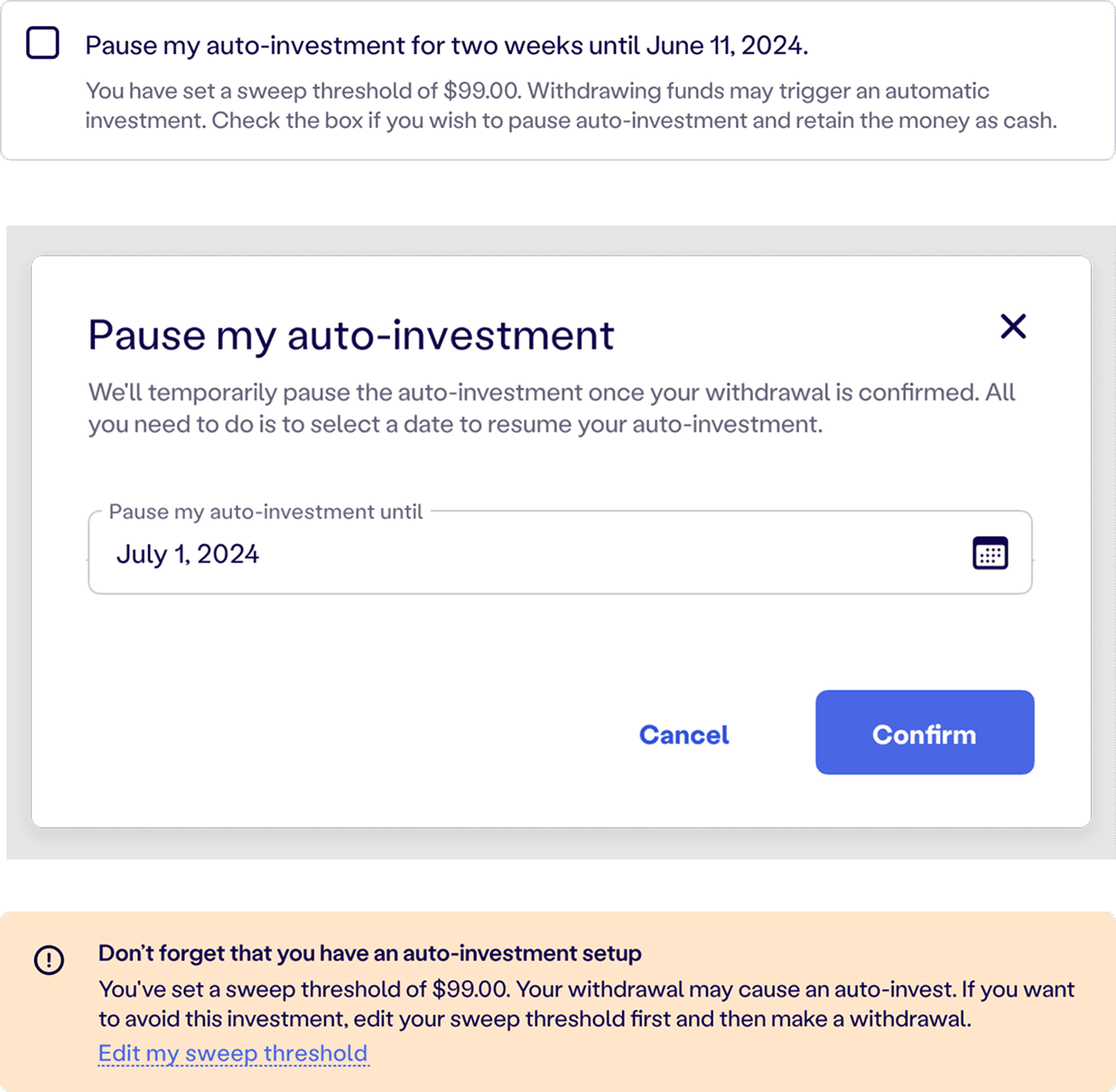
What I explored💡

To solve this, I explored multiple directions. We considered:

• Auto-pausing for a fixed time (such as two weeks)

• Letting users choose their own pause duration

• Adding passive nudges like “Don’t forget auto-invest is on”

Each option had tradeoffs. Some added too much complexity or required manual reactivation, while others felt vague or too easy to miss. Our biggest constraint was that we needed a solution that was clear, low-effort, and technically feasible.

The solution: Default pause with opt-out control ✅

The solution ✅

We landed on a simple, effective fix. When users initiate a withdrawal and have auto-investing enabled, we show a checkbox that says “Pause my automatic investment.” It is selected by default, but users can uncheck it or resume auto-invest later with one click.

This small design change prevents unintended reinvestment, gives users control at the exact moment they need it, and avoids adding friction to the withdrawal flow.

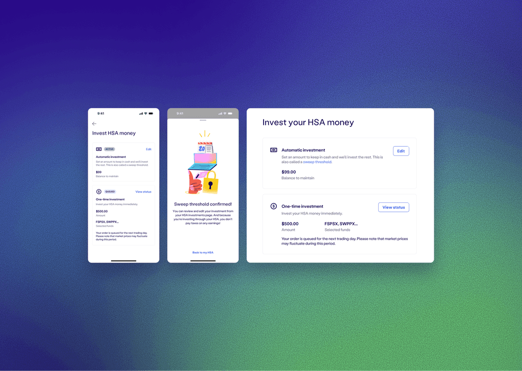
Responsive & mobile app

After finishing the core flow, I brought the design into the responsive web version and the mobile app.

Impact

By solving a major usability gap and introducing automation, we turned investing into a value-add instead of a source of friction. The feature helped drive meaningful user growth and satisfaction.

🟩

Recurring Sprig surveys showed a clear shift: users rating investing as “very difficult” dropped from 44% to 23% in one quarter.

🟩 Recurring Sprig surveys showed a clear shift: users rating investing as “very difficult” dropped from 44% to 23% in one quarter.

🟩 We ran recurring Sprig surveys to track sentiment. Within one quarter, the percentage of users who described investing as “very difficult” dropped from 44% to 23%.

🟩

By end of 2024, active HSA users nearly doubled from 11,000 to 23,000 after launch and promotion.

🟩 By end of 2024, active HSA users nearly doubled from 11,000 to 23,000 after launch and promotion.

🟩 By end of 2024, active HSA users nearly doubled from 11,000 to 23,000 after launch and promotion.

🟩

In 2024, no client churned due to missing investment features, a clear shift from the year before.

🟩 In 2024, no client churned due to missing investment features, a clear shift from the year before.

🟩 In 2024, no client churned due to missing investment features, a clear shift from the year before.

Thanks for watching 🩵

Thanks for watching 🩵

Thanks for watching 🩵

Explore more projects

Feel free to reach out if you’d like to chat more about the work or explore new opportunities together.

Explore more projects

Feel free to reach out if you’d like to chat more about the work or explore new opportunities together.

Explore more projects

Feel free to reach out if you’d like to chat more about the work or explore new opportunities together.

Explore more projects

Feel free to reach out if you’d like to chat more about the work or explore new opportunities together.

Create a free website with Framer, the website builder loved by startups, designers and agencies.