Date
rOLE
How it started
Impact overview
Part 1: Discovery
Mapping system logic and consent paths
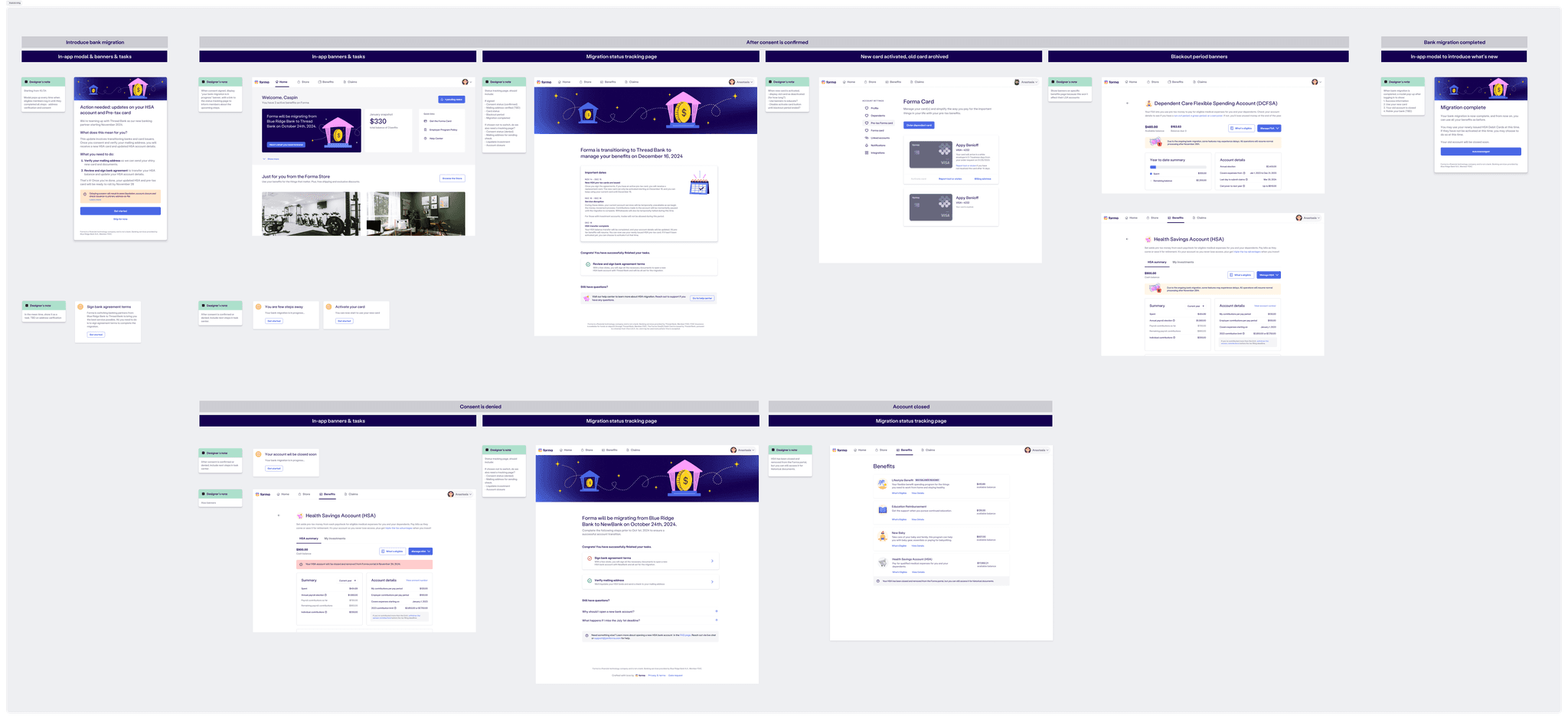
To make this complexity manageable, we created a detailed logic map outlining all key branches based on user type, consent status, and migration state. This diagram became a foundational artifact across Legal, Engineering, and Customer Support to align on conditions, communications, and triggers. It also helped the Product team clearly scope what needed to be designed and built at each step.
In this flowchart, blue boxes represent steps owned by Forma, including in-app modules and communications. Gray boxes show actions handled by Unit, our banking service provider responsible for the consent flow and account transfer. Since users did not recognize Unit, we had to guide them from the Forma interface into Unit’s white-labeled flow. The light blue background highlights work handled by our Employee Portal team.

Visualizing the logic helped us align the team, but it also surfaced a few major uncertainties that needed quick, strategic decisions.
Unknowns in the Unit flow
While Unit was responsible for the consent experience, their flow was still in progress when we began design. We didn’t know exactly what data they would collect or whether address verification would be part of it. Since that detail mattered for things like mailing checks and cards, we had to quickly decide whether Forma should handle that step before sending users over. That uncertainty shaped how we scoped our own flow and what fallback logic we needed in case things changed.
Prioritizing what mattered most
It was clear from the beginning that we wouldn’t have time to build everything. So we focused on the happy path, the core journey that would help most users opt in and complete migration without issues. We made deliberate tradeoffs, pushed some edge cases to later phases, and simplified wherever possible. The goal was to make sure the essential path felt smooth, clear, and low effort, especially for users who just needed to get through the process.
Planning communication around user actions
To align messaging with each user action, we held a cross-functional brainstorm to map communication needs across the entire journey. For each key moment, whether it was giving consent, receiving a card, or entering blackout, we asked what the user needs to know, when they should hear it, and how we should deliver it.

This helped the team get a shared understanding of what needed to be built and when. At the same time, I used it as a reference to begin my first round of design drafts.
Part 2: Design
Translating the flow into portal touchpoints
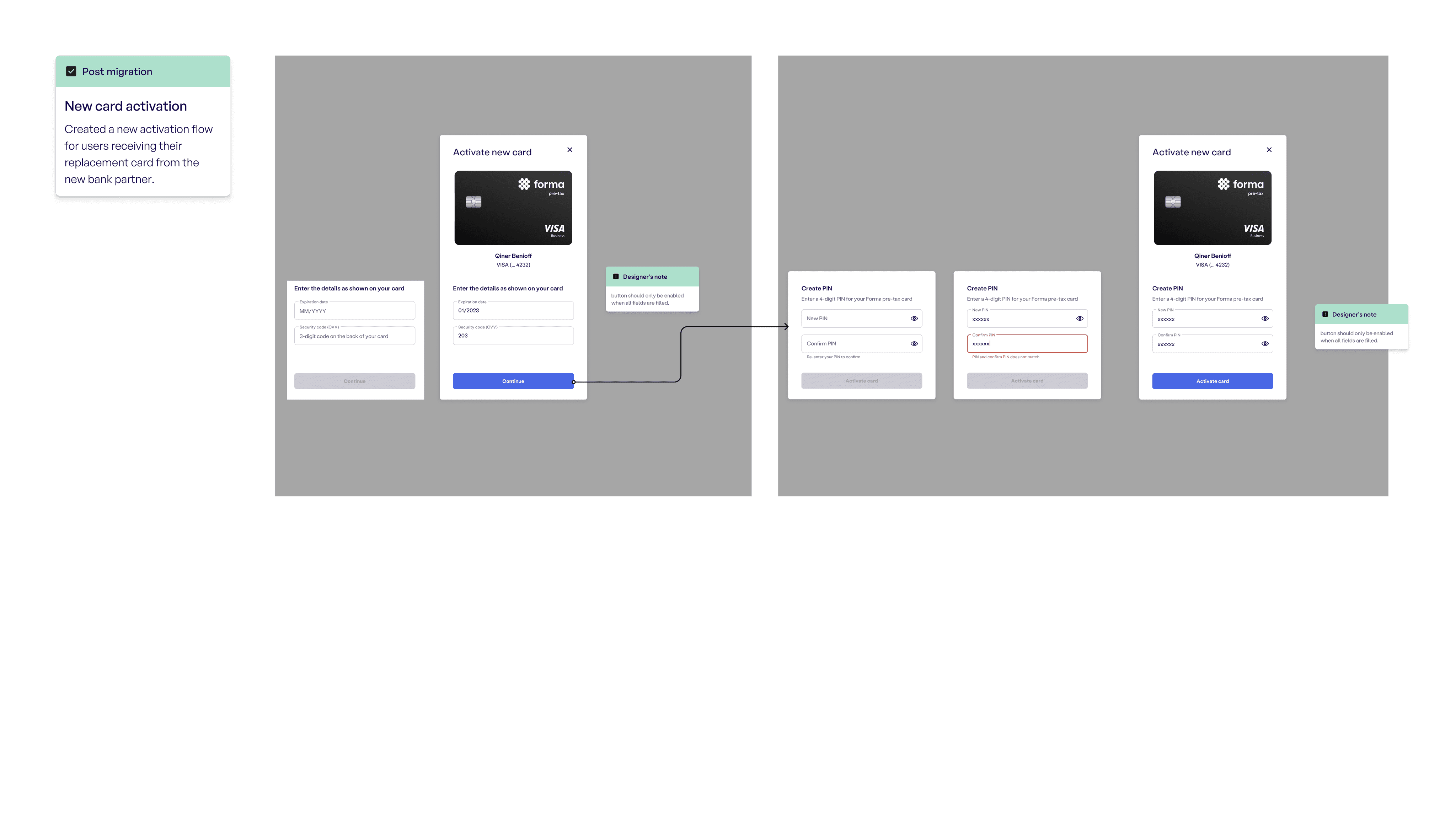
As the designer responsible for the member portal experience, I began mapping out what users would see and do at each point in time. Every time someone logged into Forma during the migration period, they needed to understand what was happening and what action they needed to take.
I looked closely at how our flow would affect different pages and entry points. For each screen, I considered what kind of education, prompts, or guidance we needed to provide to reduce confusion and keep users moving forward. I created quick mockups to explore these ideas and shared them with teammates to align on the user experiences.
Milestone 1: Live by November 14
Designing the entry point for opt-in
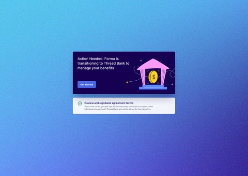
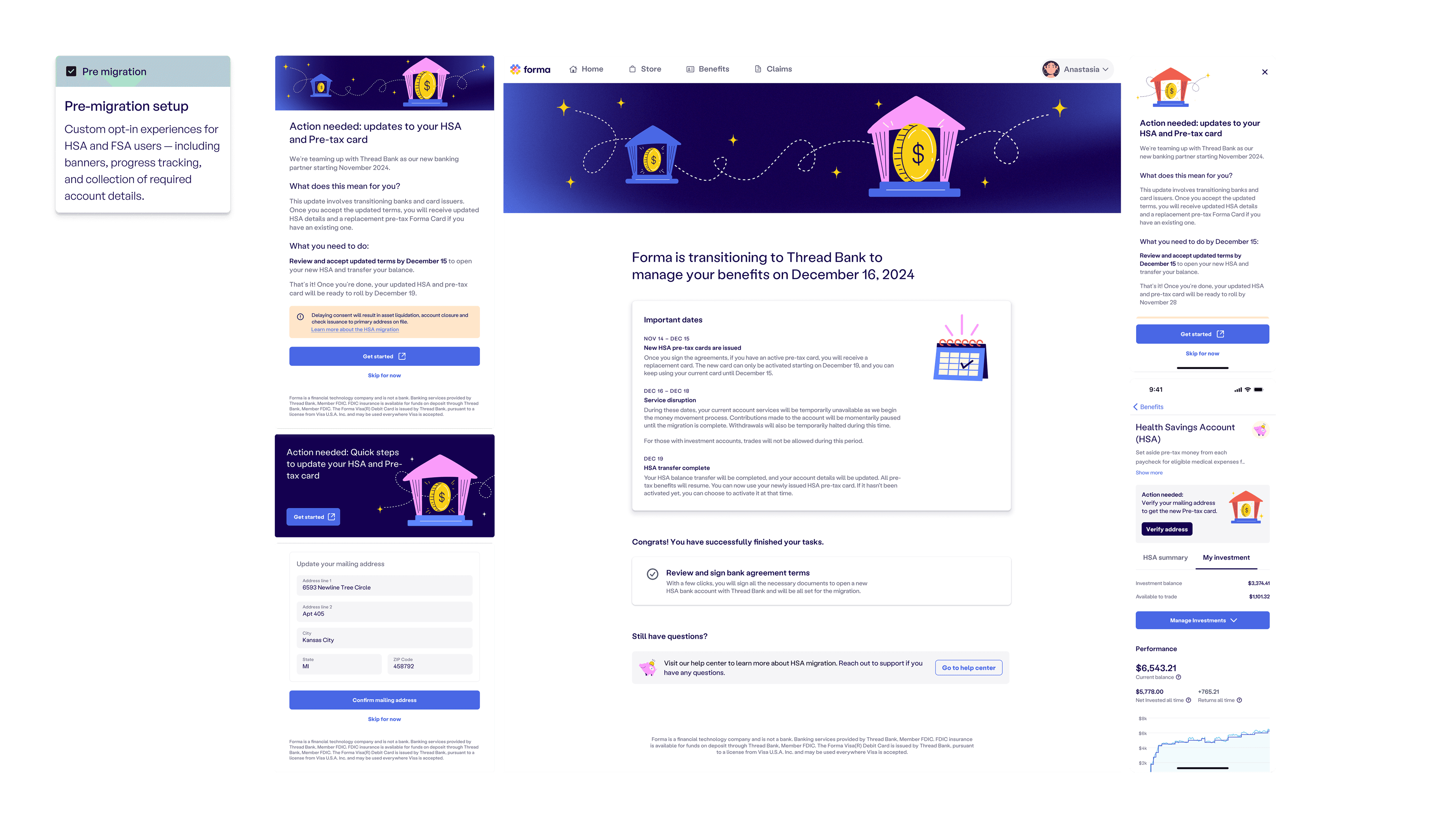
After mapping out the key portal surfaces and mocking up how different messages might show up across pages, I shifted focus to our first design milestone: creating an entry point for users to understand the migration and opt in to the consent flow. This was the most urgent and critical piece of the experience. Without user consent, we couldn’t begin the account migration, so the action had to be both clear and unavoidable.
Choosing the right format
I quickly ruled out banners or passive task reminders. These patterns were easy to overlook, and this action needed to feel urgent. I proposed a post-login modal instead. It appears immediately after login and blocks the rest of the interface, making the message impossible to ignore. It also gave the migration the weight it deserved.

Getting the language right
Language was critical. Most users would already have some context from their employer, so this wasn’t their first time hearing about the migration. What they needed now was clarity: what was changing, and what they needed to do next. I tested several copy variations and landed on a structure that prioritized those two questions: “What does this mean for you?” and “What you need to do.”
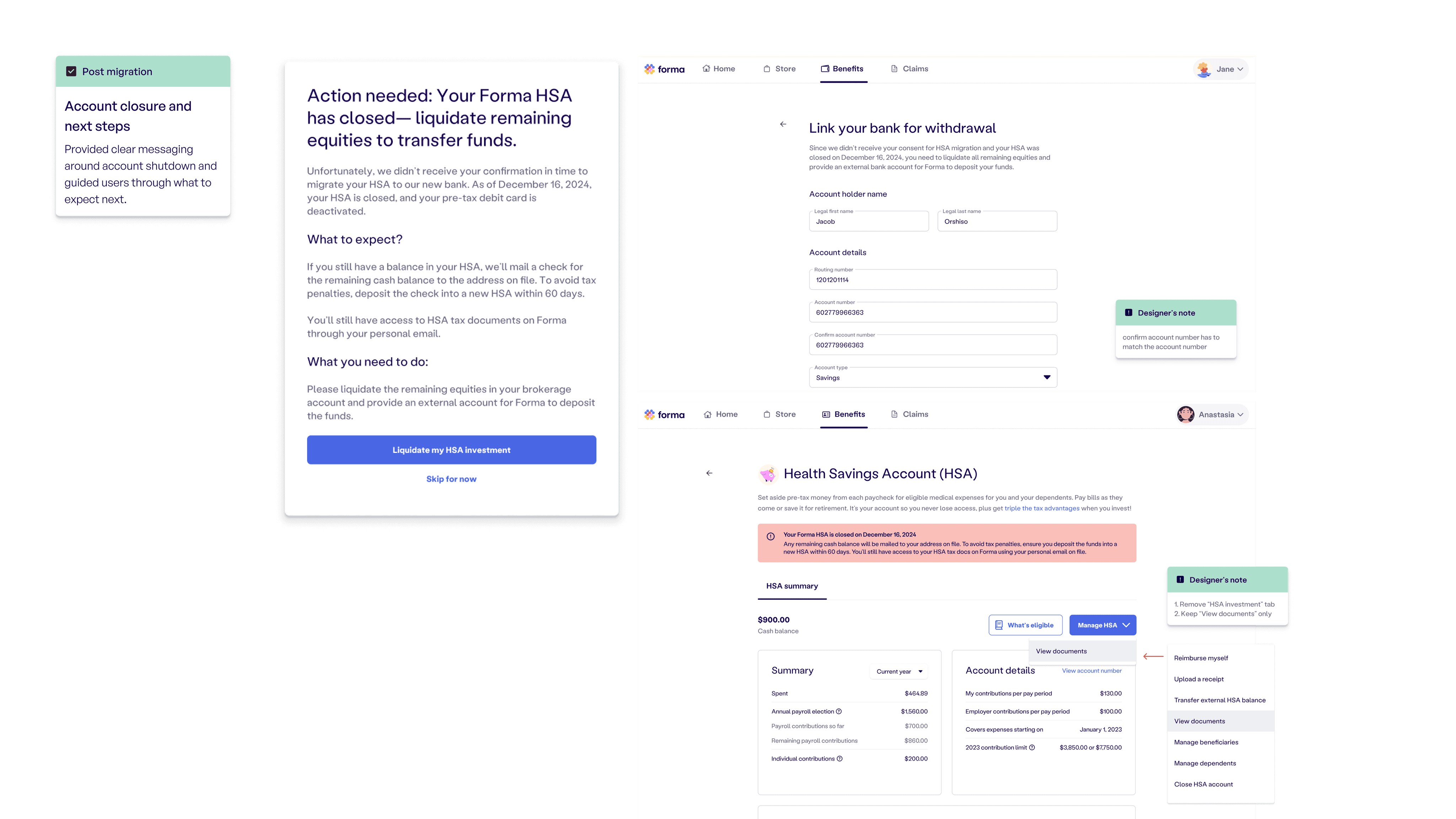
Removing the decline path
To simplify logic and improve conversion, we decided not to include a “I do not consent” option. That path would have triggered downstream questions and state changes. Instead, users could choose “Skip for now,” which would simply bring the modal back the next time they logged in. This gave users flexibility without introducing additional complexity for the system.