Redesigning Wish Local to support merchants during the pandemic

Redesigning Wish Local to support merchants during the pandemic

Redesigning Wish Local to support merchants during the pandemic

Date

2020

rOLE

Product designer

In 2020, I worked on the Wish Local app alongside another senior product designer, focusing on improving merchant experience during a pivotal moment for small businesses. I led the redesign of the merchant dashboard and the Sell on Wish product upload flow – two key areas that helped local stores navigate and adapt to the challenges of the pandemic.

Background

Wish Local is a program launched in 2019 to help small, independent retailers increase foot traffic and grow sales. Participating stores serve as local pickup spots for Wish customers and earn cash bonuses when users collect their packages in-store.

When I joined the project, our initial goal was to increase app engagement and usage among merchants. We conducted in-person visits and interviews with local business owners to better understand how they used the app and where they struggled. These insights laid the foundation for a major dashboard redesign.

However, when the COVID-19 pandemic hit, our priorities shifted. With stores under lockdown and foot traffic disappearing overnight, we needed to quickly pivot. We decided to double down on Sell on Wish – a feature that allowed approved merchants to upload and sell their own products on the Wish Local app. While the feature already existed, it suffered from a high drop-off rate. Our goal was to turn it into a lifeline for struggling businesses.

🏁 Here’s what you’ll find in the next few scrolls:

🏁 Here’s what you’ll find in the next few scrolls:

Project 1: A more engaged dashboard that improved visibility and task completion for busy store owners

Project 1: A more engaged dashboard that improved visibility for busy store owners

Project 1: A more engaged dashboard that improved visibility and task completion for busy store owners

(Read time: ~3 minutes)

(Read time: ~3 minutes)

Project 2: A simpler Sell on Wish experience that that boosted completion rates

Project 2: A simpler Sell on Wish experience that that boosted completion rates

(Read time: ~5 minutes)

(Read time: ~5 minutes)

For the full project process and design rationale, feel free to reach out 📩

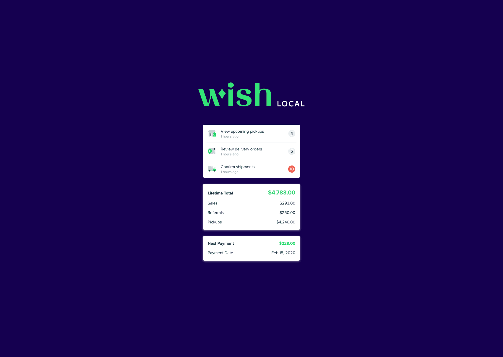
Project 1: Rethinking the dashboard to drive engagement

What we learned from store visits

What we learned from store visits

What we learned from store visits

In my first month at Wish, I joined two other designers on visits to a handful of Wish Local merchants in San Francisco. We wanted to understand how store owners handled Wish packages and how they used the app in their day-to-day work.

We quickly uncovered a critical insight: most store owners were only using one part of the app — the barcode scanner. They used it to confirm pickups and nothing else.


Despite having access to a range of features, many had never checked their earnings dashboard, seen a notification, or even heard of Sell on Wish.


This pointed to a core issue: low feature discoverability and poor engagement.

Why the old dashboard wasn’t working

Why the old dashboard wasn’t working

Why the old dashboard wasn’t working

The original dashboard prioritized scanning at the cost of everything else. While confirming package pickups was essential, the rest of the experience lacked clarity, structure, and guidance, making it hard for users to discover or engage with any other features.

  1. The scan button took up too much space and disappeared when users scrolled, breaking the flow

  2. Promo banners were overlooked. Most users didn’t realize they were tappable or swipeable

  3. Important Updates mixed notifications, announcements, and promotions without clear distinction or hierarchy

  4. Key metrics like earnings and pickups were displayed inconsistently and offered no actionable insights

  5. There was no sense of what users should do next, leading to low feature discovery and engagement

  1. The scan button took up too much space and disappeared when users scrolled, breaking the flow


  2. Promo banners were overlooked. Most users didn’t realize they were tappable or swipeable


  3. Important Updates mixed notifications, announcements, and promotions without clear distinction or hierarchy


  4. Key metrics like earnings and pickups were displayed inconsistently and offered no actionable insights


  5. There was no sense of what users should do next, leading to low feature discovery and engagement

  1. The scan button took up too much space and disappeared when users scrolled, breaking the flow

  2. Promo banners were overlooked. Most users didn’t realize they were tappable or swipeable

  3. Important Updates mixed notifications, announcements, and promotions without clear distinction or hierarchy

  4. Key metrics like earnings and pickups were displayed inconsistently and offered no actionable insights

  5. There was no sense of what users should do next, leading to low feature discovery and engagement

Redesigning for clarity and action

Redesigning for clarity and action

Redesigning for clarity and action

To address this, I redesigned the home dashboard to help store owners quickly see what matters most:

  1. Surface their daily tasks and earnings front and center

  2. Promote new features like Sell on Wish as a top-level entry point

  3. Make it easier to track shipments and sales at a glance

Final design

Final design

Final design

Final dashboard and more pages

Style guide and design library

New icons

📩 For more details about the Wish Local dashboard redesign, feel free to reach out!

For more details about the Wish Local dashboard redesign, feel free to reach out 📩

Project 2: Improving the Sell on Wish flow

When the pandemic hit and foot traffic dropped, Sell on Wish became a key way for local businesses to stay afloat. The feature allowed store owners to upload their own products and sell them directly through the Wish app.

Drop-off rate was super high

Drop-off rate was super high

Drop-off rate was super high

But despite strong interest, the actual usage told a different story. Adoption was low, and nearly 70% of merchants dropped off during the upload flow, often before completing their first product listing. Why?

To understand what was going wrong, we took a closer look at the existing flow

70%

of users drop-off during the overall uploading process

drop in user-reported investment difficulty

Where the flow broke down

Where the flow broke down

Where the flow broke down

After walking through the full upload experience ourselves and observing how merchants interacted with it, we identified several major usability issues. These friction points made the process especially difficult for new or non-technical users, and contributed to the high drop-off rate.

1. Lack of onboarding

1. Lack of onboarding

1. Lack of onboarding

There was no explanation of how Sell on Wish worked or what users would gain from listing their products. Even on the first two screens, new users were left without any guidance or context to help them get started.

There was no explanation of how Sell on Wish worked or what users would gain from listing their products. Even on the first two screens, new users were left without any guidance or context to help them get started.

There was no explanation of how Sell on Wish worked or what users would gain from listing their products. Even on the first two screens, new users were left without any guidance or context to help them get started.

2. Lack of progress indicators

2. Lack of progress indicators

2. Lack of progress indicators

The upload flow was split into multiple screens (product info, quantity, price, photos) with no clue of how long the process would take. Without a clear sense of what came next, many users abandoned the task midway.

The upload flow was split into multiple screens (product info, quantity, price, photos) with no clue of how long the process would take. Without a clear sense of what came next, many users abandoned the task midway.

The upload flow was split into multiple screens (product info, quantity, price, photos) with no clue of how long the process would take. Without a clear sense of what came next, many users abandoned the task midway.

3. No save or return options

3. No save or return options

3. No save or return options

Merchants often needed to multitask or step away, but there was no way to save progress and return later. Any interruption meant starting over.

Merchants often needed to multitask or step away, but there was no way to save progress and return later. Any interruption meant starting over.

Merchants often needed to multitask or step away, but there was no way to save progress and return later. Any interruption meant starting over.

4. Missing preview and feedback

4. Missing preview and feedback

4. Missing preview and feedback

There was no product preview and no confirmation of what users had just completed. This left them unsure what the listing would look like to customers.

There was no product preview and no confirmation of what users had just completed. This left them unsure what the listing would look like to customers.

There was no product preview and no confirmation of what users had just completed. This left them unsure what the listing would look like to customers.

How I redesigned the experience

How I redesigned the experience

How I redesigned the experience

After conducting competitive research, multiple design iterations, and continuous feedback from both users and internal stakeholders, I addressed each problem in the flow step by step. Here’s the final solution:

1. A simplified one-page upload flow

1. A simplified one-page upload flow

1. A simplified one-page upload flow

Instead of breaking the form across multiple screens, I combined all required fields into a single page. This gave busy store owners a clear view of how much they needed to fill out.

Based on early usability testing, we learned that many users overlooked information icons. To make help more accessible, I replaced those icons with short in-line descriptions for each field (What is MSRP?).

2. Save as draft for interrupted sessions

2. Save as draft for interrupted sessions

2. Save as draft for interrupted sessions

During store visits, I saw firsthand how chaotic retail environments could be. Our interviews were often interrupted by incoming customers, which made it clear that sellers would likely need to pause mid-task.

During store visits, I saw firsthand how chaotic retail environments could be. Our interviews were often interrupted by incoming customers, which made it clear that sellers would likely need to pause mid-task.

During store visits, I saw firsthand how chaotic retail environments could be. Our interviews were often interrupted by incoming customers, which made it clear that sellers would likely need to pause mid-task.

To support this, I introduced a “Save as Draft” option and explored two layout patterns for where drafts should live.

We ultimately chose Version 2, which placed drafts in a secondary location with a prominent card to serve as a visual reminder that listings were incomplete.

To support this, I introduced a “Save as Draft” option and explored two layout patterns for where drafts should live.

We ultimately chose Version 2, which placed drafts in a secondary location with a prominent card to serve as a visual reminder that listings were incomplete.

To support this, I introduced a “Save as Draft” option and explored two layout patterns for where drafts should live.

We ultimately chose Version 2, which placed drafts in a secondary location with a prominent card to serve as a visual reminder that listings were incomplete.

3. Onboarding with contextual tooltips

3. Onboarding with contextual tooltips

3. Onboarding with contextual tooltips

To improve feature discoverability, I added lightweight tooltips that appear when users return to the app. These nudges helped highlight the Sell on Wish flow and encouraged merchants to try it out.

To improve feature discoverability, I added lightweight tooltips that appear when users return to the app. These nudges helped highlight the Sell on Wish flow and encouraged merchants to try it out.

To improve feature discoverability, I added lightweight tooltips that appear when users return to the app. These nudges helped highlight the Sell on Wish flow and encouraged merchants to try it out.

4. A more reassuring success state

4. A more reassuring success state

4. A more reassuring success state

Previously, the success screen was just a confirmation message. I replaced it with a preview of what the product would look like to Wish customers. This small change gave store owners a confidence boost and made the experience feel more professional and complete.

Previously, the success screen was just a confirmation message. I replaced it with a preview of what the product would look like to Wish customers. This small change gave store owners a confidence boost and made the experience feel more professional and complete.

Previously, the success screen was just a confirmation message. I replaced it with a preview of what the product would look like to Wish customers. This small change gave store owners a confidence boost and made the experience feel more professional and complete.

The final design & full flows

Thanks for watching 🩵

Thanks for watching 🩵

Thanks for watching 🩵

Explore more projects

Feel free to reach out if you’d like to chat more about the work or explore new opportunities together.

Explore more projects

Feel free to reach out if you’d like to chat more about the work or explore new opportunities together.

Explore more projects

Feel free to reach out if you’d like to chat more about the work or explore new opportunities together.

Create a free website with Framer, the website builder loved by startups, designers and agencies.